October sees many themes and special events at San Francisco Public Libary—¡VIVA!, FILAM, and pumpkin contests, just to name a few. On a national scale, it also happens to be Italian American Heritage month. Let's talk Italy and newspapers on this ultimate day of October.
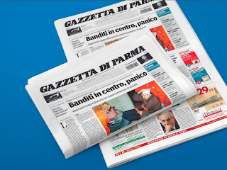
The Gazzetta di Parma
When you think of Parma in the North of Italy (link to Google Maps), you probably think about its famous cheese and prosciutto. Maybe you also think of its architecture and theater. Do you think of its newspaper?
Italy's oldest continually operating newspaper is one of the oldest in the world: The Gazzetta di Parma hails from April 19, 1735 (at least that's the oldest surviving print from the paper we have), and the newspaper has been printed every day since then. If you visit Parma, you can't help but peep newsstands with the name emblazoned on their awnings and stacks of this local newspaper for sale around town. For sure, your hotel will offer complimentary copies each morning.
Print news is alive and well in this classic Italian city!
 |
| Image of Gazzetta di Parma circa 2006. Image courtesy of Wenceslau. |
The Bodoni Connection
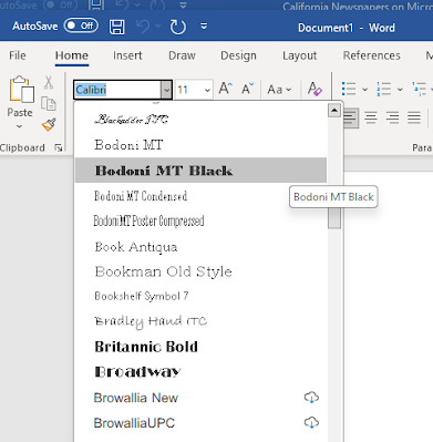
In a city famous for the longevity of its newspaper, it makes sense the history and legacy of that paper is intertwined with the city's famous Italian typographer, Giambattista Bodoni, who printed the paper from 1772-1796. Sound familiar? Bodoni is the name of some fonts you might recognize from your computer, modern serif typefaces designed in his type's likeness. The name pays homage to this heavyweight of typography and design, who left behind many type faces in addition to those in Word that now bear his name.
 |
| Screen shot of Bodoni fonts on MS Office |
On display at the Bodoni Museum in the Palazzo della Pilotta in Parma is a specimen of the newspaper printed by Bodoni in 1772, the first year he began printing the publication.
 |
| Link to enlarged image |
 |
| Link to enlarged image |
A Graphic Update to Honor History
In 2021, as an homage to its history and to update its graphic impression, the Gazzetta di Parma introduced a new look: a coat of arms now appears in the masthead (first used in the newspaper in 1745 during Bodoni's term as printer), a newly minted font for titles that integrates the best features of Bodoni's work is employed in the hierarchy of type used in the body (the new font is called Gazzetta di Parma 1735), and other changes have been implemented that usher in greater readability and make room for in-depth coverage of a range of issues.
 |
| Link to enlarged image |
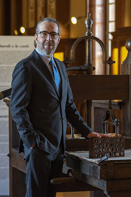
"It is precisely with readers in mind that for our birthday we have designed a reform that renews the graphics - to make the 'Gazzetta' more beautiful, more elegant, tidier and more readable - and enriches the contents, with new columns, more space for in-depth analysis and ever greater attention to what is happening in Italy and around the world. Naturally without betraying our local vocation. Indeed, remaining firmly attached to our tradition and our history. Because our future is in our roots." --Director Claudio Rinaldi [Translated from Italian by Google Translate]
 |
| Claudio Rinaldi, director of the Gazzetta di Parma, with Bodoni's type matrices. Tobia 1952, CC BY-SA 4.0, via Wikimedia Commons |
"It is a project which captures the identifying traits of the historical heritage and useful ideas for graphic culture to respond to the needs of readability, clarity and authority, typical traits of the approach of quality expressed by the Gazzetta di Parma" -- Administrative Delegate Pierluigi Spagoni [Translated from Italian by Google Translate]
Bringing It Home to San Francisco
There is a risk involved in sharing the story of this historic Italian newspaper, and that is not being able to deliver it to our SFPL users for reading and viewing.
That's right: this is not a paper provided through San Francisco Public Library, but we wanted to share its history and typographic accolades with our newsy followers out there anyway.You can check it out on the newspaper's online reader portal.
What do you think about this in relation to our local papers, the San Francisco Chronicle and the San Francisco Examiner? Does the blackletter masthead our local papers use—such a traditional style of United States newspapers—remain relevant in 2023, or could it do with a facelift as well?
For Further Reading
Clough, James. "Bodoni and his roman and italic types," 26 August 2018. CAST. https://articles.c-a-s-t.com/bodoni-and-his-roman-and-italic-types-a15325d03b06
(N.A.) "Editoria: la Gazzetta di Parma rinnova grafica e contenuti," 18 April 2021. Ansa.it. https://www.ansa.it/emiliaromagna/notizie/2021/04/18/editoria-la-gazzetta-di-parma-rinnova-grafica-e-contenuti_afb6bd73-7e07-4b3c-8d81-50ce0fd89107.html
Troiano, Donat. "La Gazzetta di Parma rinnova grafica e contenuti per il 286/o compleanno," 20 April 2021. GUSTOH24. https://www.gustoh24.it/la-gazzetta-di-parma-rinnova-grafica-e-contenuti-per-il-286-o-compleanno/
No comments:
Post a Comment